Launching developer documentation
Timeframe
8 weeks + ongoing enhancements
Team
Overview
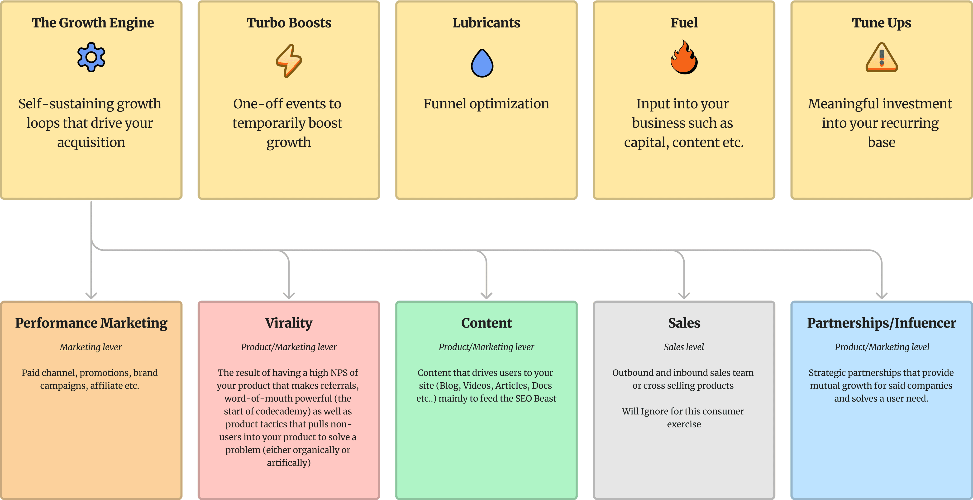
Hypotheses
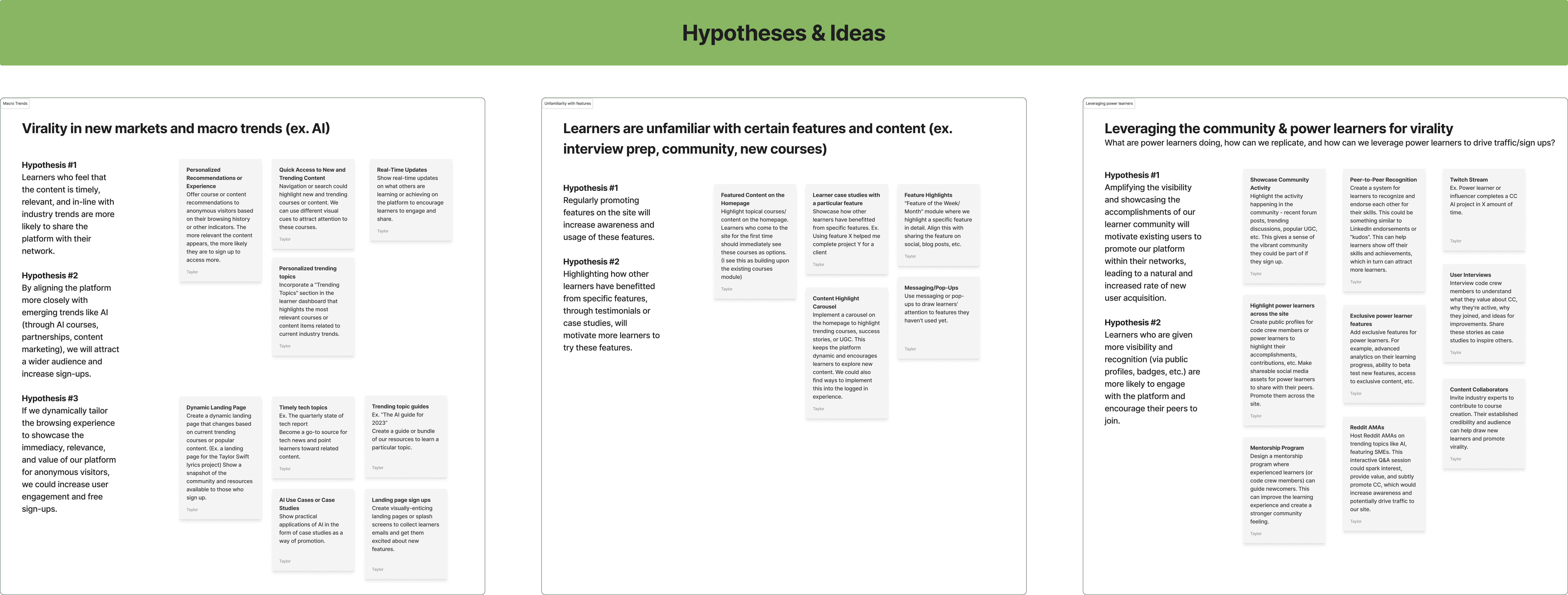
After identifying key problems, I set up a FigJam for the PM and I to brainstorm solutions and develop hypotheses. We ultimately prioritized focusing on aligning with industry trends, tailoring the browsing experience, promoting features, and highlighting the community.
Inspiration
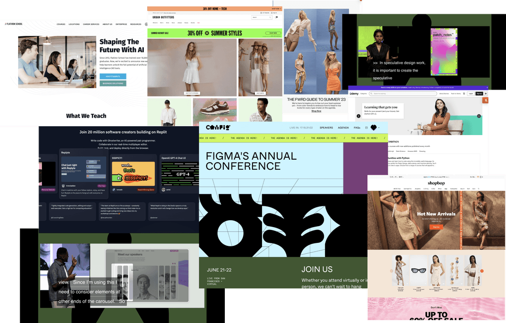
Before advancing these ideas, I explored conceptual solutions across various industries, focusing on e-commerce for timely displays of information and EdTech for presenting value propositions.
My goal was to determine the best timing and methods for presenting compelling information and how to show rather than tell.
During this time, Config was taking place, and I drew layout and visual design inspiration from the slide presentations.
Dynamic landing pages
Engaging users with relevant and current content.
Feature displays
Highlighting key platform features to increase user engagement.
Trending content modules
Keeping users informed and engaged with the latest industry trends.
Community showcasing
Promoting user achievements to foster a sense of community and drive sign-ups.
Engineering input & prioritization
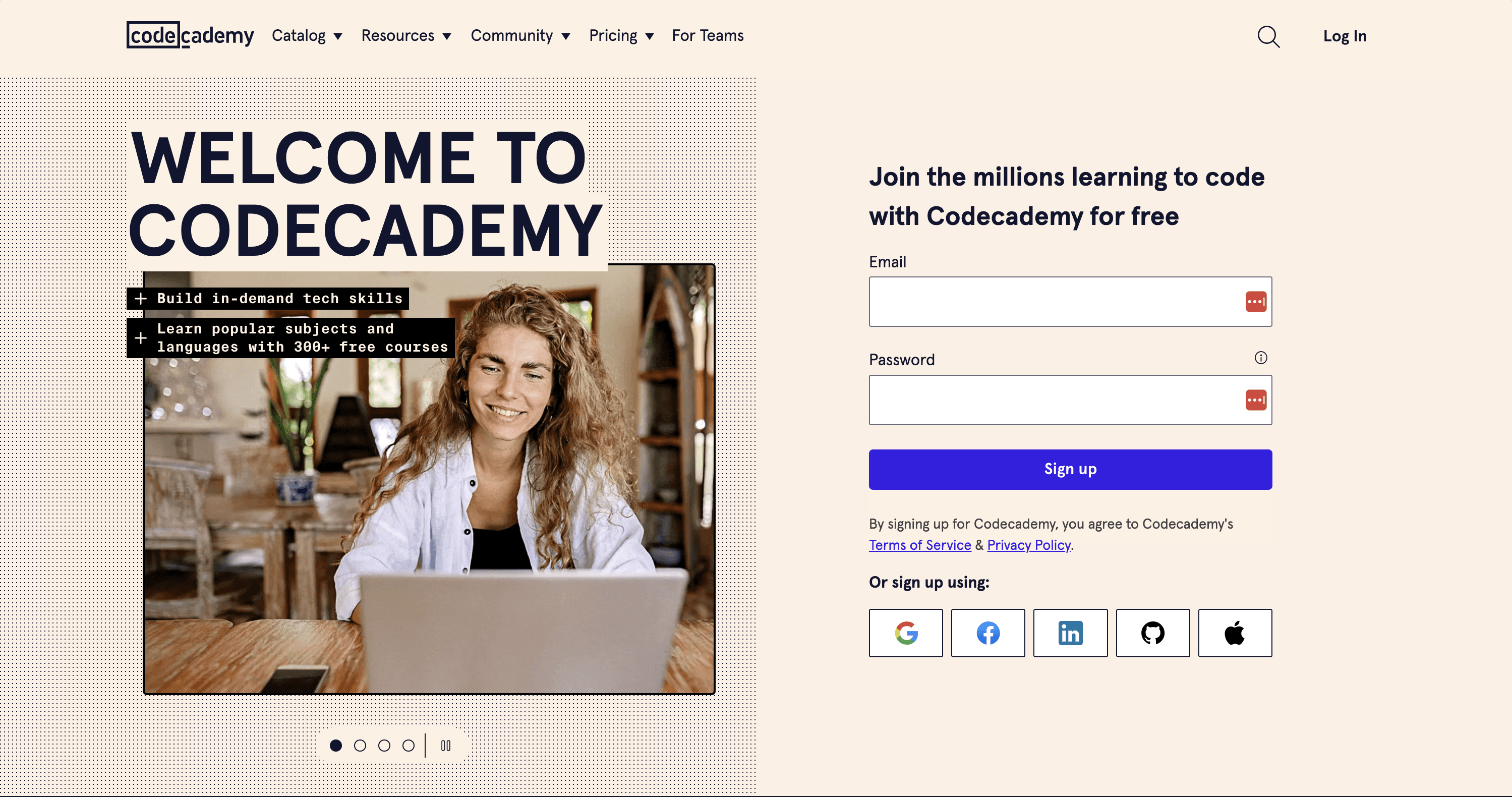
After the discovery phase, we identified the homepage and container landing pages (course, skill path, career path) as key areas for experimentation due to their high visibility. We prioritized features like dynamic modules, a carousel, and video to better showcase new offerings.
Early involvement of engineering provided insight into the technical feasibility of these ideas, including dynamic modules, personalization, and access to learner data.
Explorations
It was time to delve into the various strategies and solutions we had identified. I created multiple explorations to display the features in an engaging and easily digestible format.
Considering the need for future adaptability, it was crucial to ensure that these modules could be templated, allowing the Marketing team to update the content effortlessly.
Stakeholder reviews
Following a few rounds of exploration, during which I incorporated insights from design team critique, it was time to present these preliminary concepts to stakeholders.
Prior to our scheduled live discussion, I created a Loom walkthrough and provided a comprehensive Figma for stakeholders to review. This pre-meeting preparation enabled participants to familiarize themselves with the designs, ensuring a more productive meeting.
During the sync, I showcased design solutions for each of our objectives: the carousel, the platform showcase module, and the live events banner.
High-fidelity & prototyping
I mocked up several layouts, which informed the required assets from Marketing. There was some push and pull as I needed illustrations and content to inform the design. However, I leveraged existing images and illustration to provide a more realistic view.
This phase required extensive prototyping to explore micro-interactions, color usage, and pinpointing design solutions that best highlighted the content of each module.
Refining the carousel component
Given the possibility of integrating this carousel component into our design system, I researched accessibility best practices, including features like autorotation. I prototyped the carousel to identify optimal time delays and transition effects for autorotation.
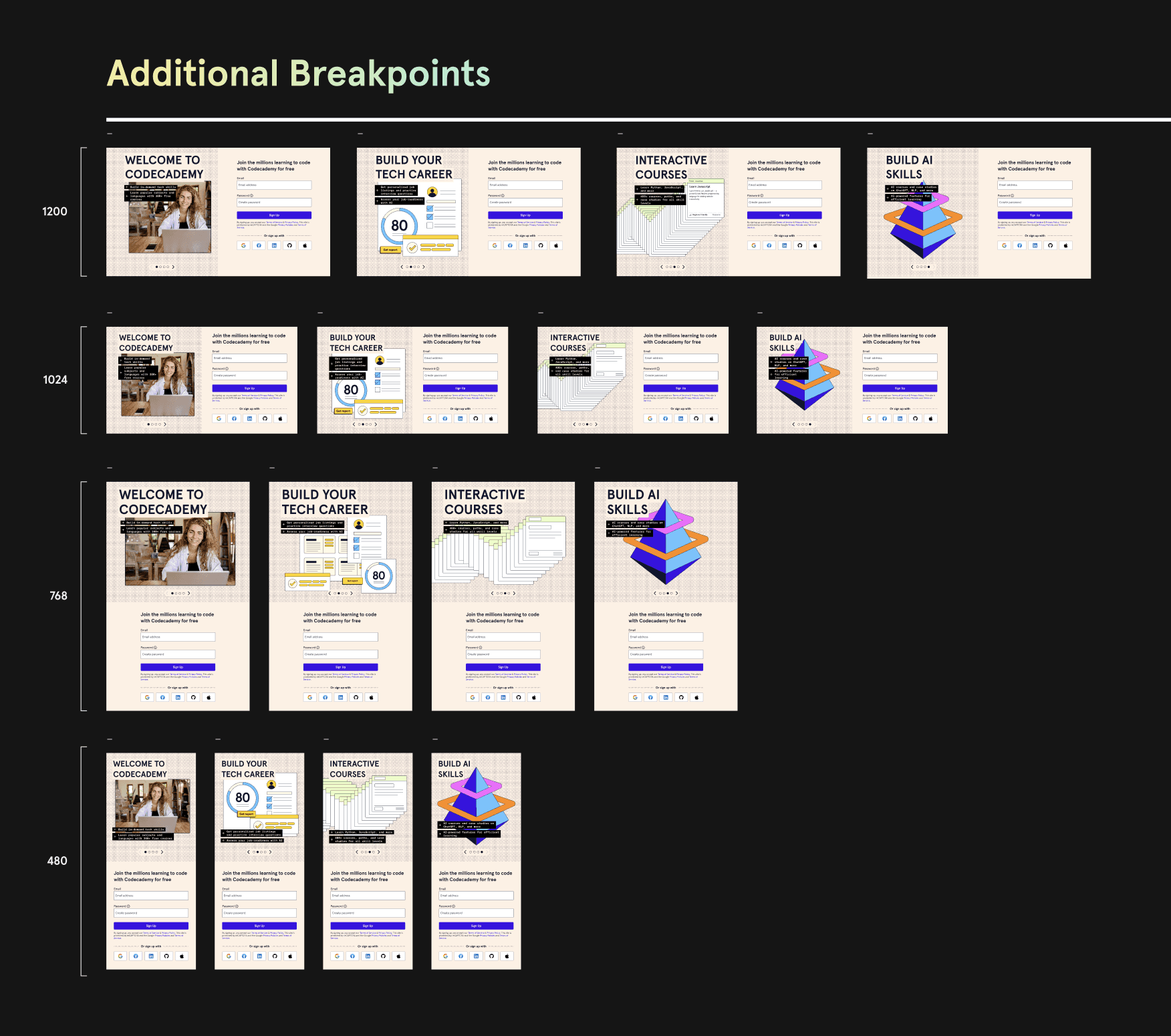
After receiving final illustrations from Brand Design, I carefully crafted each breakpoint, adjusting images across screen sizes.
Handoff to engineers
To optimize handoffs, I recorded Loom walkthroughs of specs before the live handoff meeting, allowing engineers to review them in advance. This made our sessions more streamlined, as we could focus on questions, clarifications, and concerns. Regular design check-ins throughout the workflow ensured transparency and eliminated unexpected challenges during handoffs.
Components, specs, & templatizing
Given the novelty and complexity of these components, the specs required a high level of detail. I also wanted to keep in mind a future where we may "componentize" some of these modules and interactions.
The carousel posed challenges with layout and image variations between breakpoints and for each slide. Likewise, the carousel controls required considerations for time delays, transitions, and accessibility.
In addition, the platform showcase and live events banner were intricate, featuring an auto-scrolling mechanism, as well as required hover and press states.
Launch & where we are now
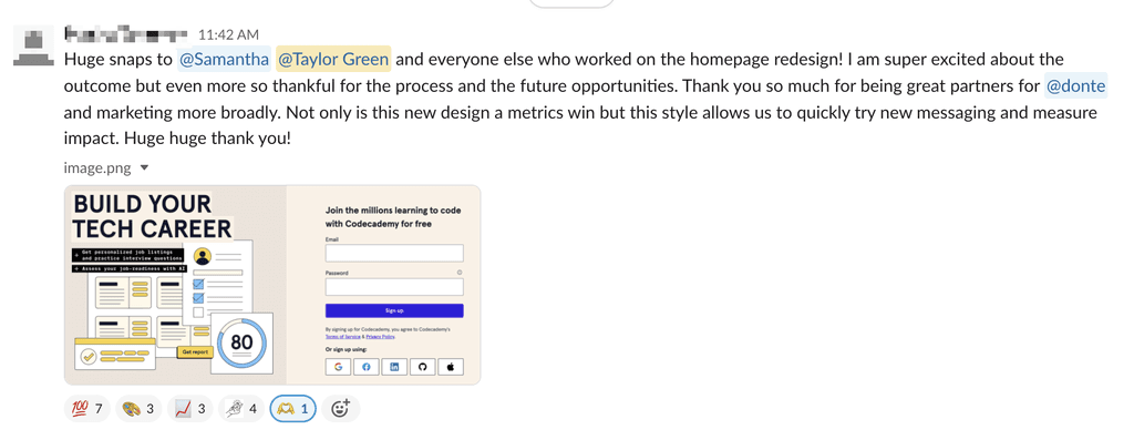
Since the full rollout of the carousel, we have conducted several experiments with the slide content, aligning with current marketing campaigns and industry trends, consistently seeing around an 8% increase in signup rate.
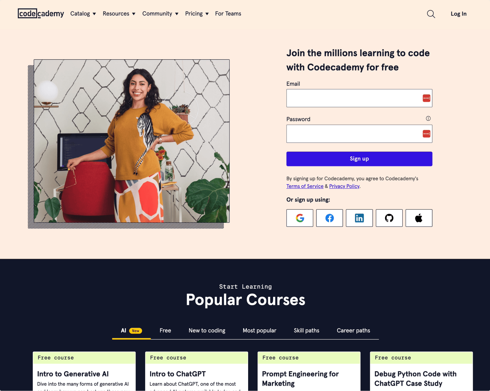
We also implemented the platform showcase on our homepage and course landing pages, making it a key space for Marketing to continually communicate new offerings.


